
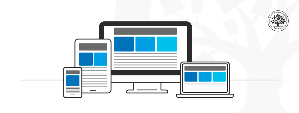
Mobile UX enhancements beyond responsive design focus on leveraging device-specific features, adaptive content strategies, and gesture-based interactions to create richer, more intuitive experiences tailored to mobile users.
Key enhancements include:
-
Harnessing Native Device Capabilities: Utilizing mobile-specific hardware such as cameras for image capture or AI-powered scanning (e.g., credit card scanning), and GPS for location-aware features like smart defaults or localized content. These capabilities provide convenience and efficiency beyond what responsive design alone offers.
-
Incorporating Gesture-Based Interactions: Designing for native mobile gestures such as pinch zoom, swipe, and horizontal scrolling can improve navigation and engagement. Despite initial skepticism, these gestures are increasingly recognized as essential for mobile UX, enabling more natural and fluid user interactions.
-
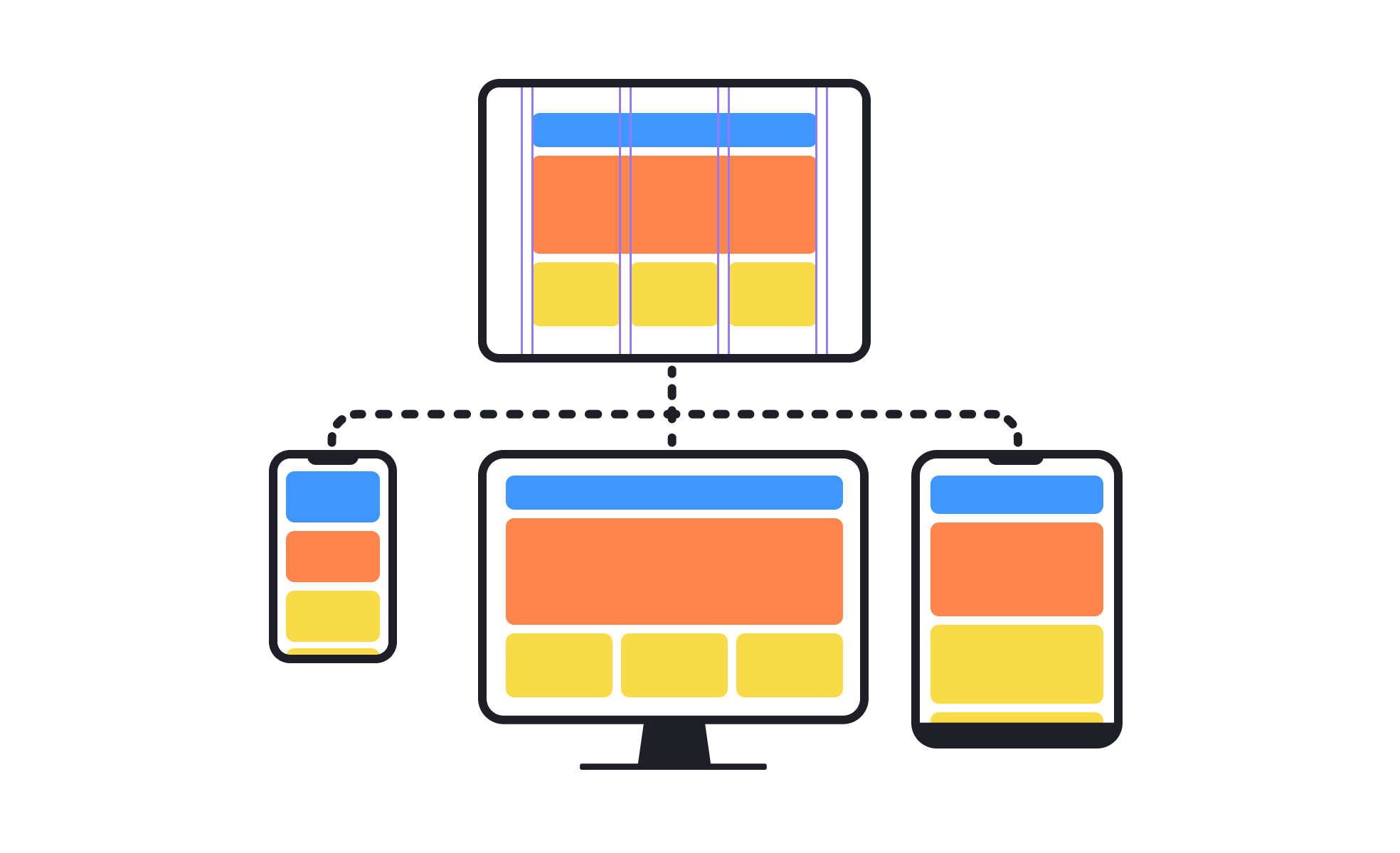
Designing Adaptive Components Beyond Screen Size: Moving past pixel-perfect responsive breakpoints, adaptive design considers content priority, information architecture, and user journey context to create components that adjust to varying layouts, container sizes, and real-world content scenarios (e.g., long text, missing images). This approach builds truly adaptive systems that respond to user needs dynamically.
-
Ensuring Usability Principles Are Met: Beyond visual responsiveness, mobile UX must be useful, usable, desirable, findable, accessible, and credible. This holistic approach addresses emotional responses, user goals, and obstacles, ensuring the experience is meaningful and enjoyable throughout the entire user journey.
-
Optimizing Touch Targets and Interaction Elements: Responsive design sometimes shrinks buttons or clusters clickable elements, which can frustrate users on small screens. Mobile UX improvements involve ensuring buttons and interactive elements are appropriately sized and spaced for touch accuracy, enhancing usability.
-
Considering Mobile-Dedicated or Adaptive Sites: While responsive design adjusts fluidly to screen sizes, mobile-dedicated or adaptive sites can offer tailored experiences optimized for mobile contexts. Regardless of approach, all must adhere to mobile usability principles to be effective.
Together, these enhancements move beyond simply resizing layouts to create mobile experiences that are context-aware, intuitive, and aligned with how users naturally interact with their devices.


Maple Ranking offers the highest quality website traffic services in Canada. We provide a variety of traffic services for our clients, including website traffic, desktop traffic, mobile traffic, Google traffic, search traffic, eCommerce traffic, YouTube traffic, and TikTok traffic. Our website boasts a 100% customer satisfaction rate, so you can confidently purchase large amounts of SEO traffic online. For just 720 PHP per month, you can immediately increase website traffic, improve SEO performance, and boost sales!
Having trouble choosing a traffic package? Contact us, and our staff will assist you.
Free consultation