
To design mobile-optimized email content that maximizes click-through rates (CTR), focus on creating a clean, responsive, and user-friendly experience tailored for small screens with touch interaction. Key strategies include:
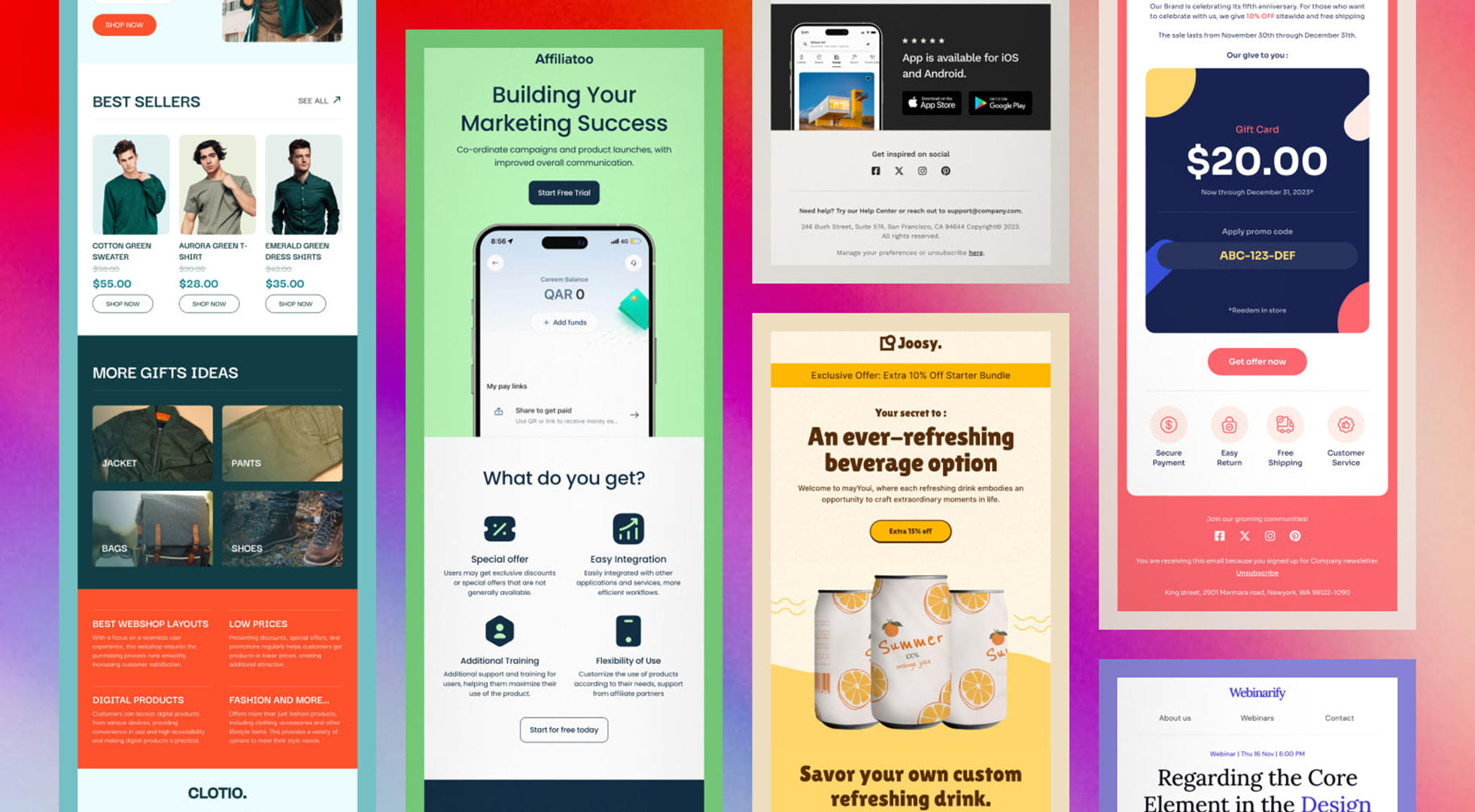
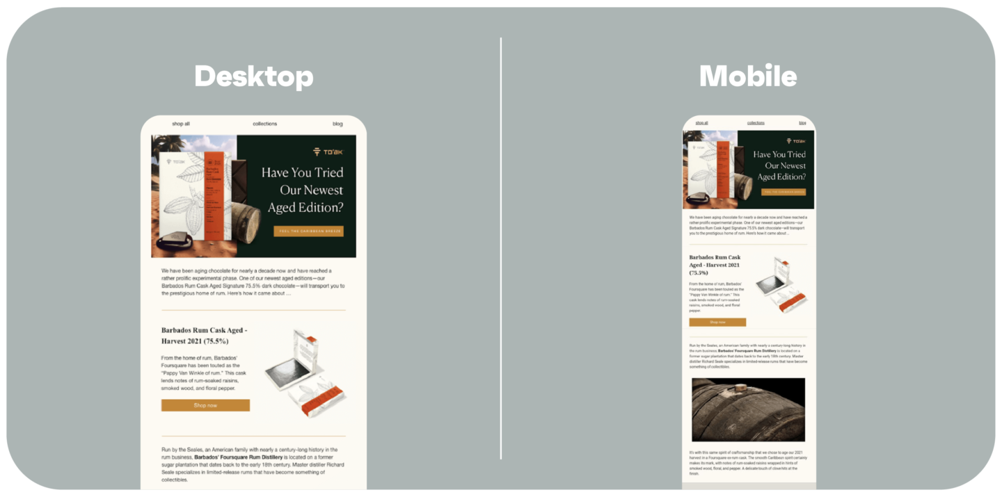
- Use a single-column layout to ensure content fits well on mobile screens and adapts to both portrait and landscape orientations.
- Place the most important content and call-to-action (CTA) near the top (above the fold) so users see it immediately without scrolling.
- Make CTAs large and touch-friendly, with a minimum size of 44x44 pixels, clear contrast, and enough spacing to avoid mis-taps.
- Limit the number of CTAs per screen, ideally one per screen view, to avoid overwhelming users and to guide them naturally toward the desired action.
- Optimize images for fast loading and high-DPI displays, compressing them and using appropriate sizes (no wider than about 600px) to avoid slow load times or broken layouts.
- Use alt text for images to maintain message clarity if images don’t load, which is common on mobile devices with limited connectivity.
- Maintain a minimalist, uncluttered design with a balanced text-to-image ratio (around 80:20) to keep focus on the CTA and improve readability.
- Choose legible font sizes (minimum 14px) and ensure good contrast between text and background for easy reading on small screens.
- Test emails in both portrait and landscape modes to ensure consistent appearance and functionality regardless of device orientation.
- Consider using animated CTAs (GIFs or videos) to increase engagement and CTR, as animations have been shown to outperform static buttons.
- Hide non-essential content on mobile to reduce distractions and focus attention on the main CTA, improving click rates.
- Personalize content deeply beyond just names, tailoring based on user behavior, preferences, or location to increase relevance and engagement.
These practices collectively enhance mobile usability, reduce friction, and guide recipients toward clicking your CTAs, thereby maximizing click-through rates on mobile devices.
Additional insights:
- Avoid navigation bars on mobile emails as they consume valuable screen space; instead, focus on a single clear CTA or a minimalistic menu if necessary.
- Use brand-consistent colors but limit the palette to fewer than five colors for a clean look; also consider dark mode compatibility.
- Compress images and use descriptive alt text to ensure accessibility and faster loading on mobile networks.
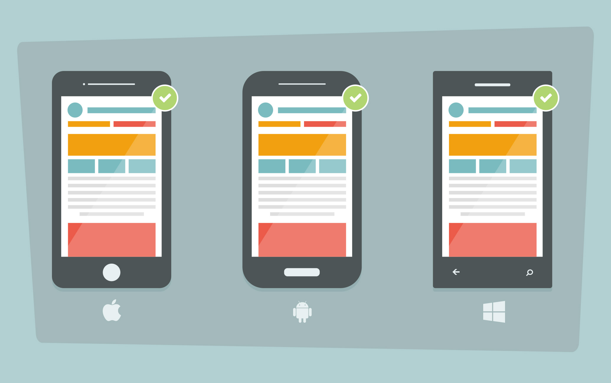
- Test your emails on multiple devices and email clients (iPhone, Android, etc.) to verify font sizes, image display, and CTA functionality.
By implementing these mobile-first design principles, you can significantly improve the user experience and increase the likelihood that recipients will engage with your email content on their mobile devices.


Maple Ranking offers the highest quality website traffic services in Canada. We provide a variety of traffic services for our clients, including website traffic, desktop traffic, mobile traffic, Google traffic, search traffic, eCommerce traffic, YouTube traffic, and TikTok traffic. Our website boasts a 100% customer satisfaction rate, so you can confidently purchase large amounts of SEO traffic online. For just 720 PHP per month, you can immediately increase website traffic, improve SEO performance, and boost sales!
Having trouble choosing a traffic package? Contact us, and our staff will assist you.
Free consultation