
Mobile-first content design optimizes for thumb-stopping impact by prioritizing essential content, simplifying thumb-friendly navigation, and ensuring fast, intuitive experiences on small screens to capture user attention instantly.
Core Principles
This approach starts with mobile constraints—limited space, thumb reach, and quick scrolling—to focus on high-impact elements that stop users mid-scroll. Key strategies include:
- Content-first mindset: Conduct a content audit to identify primary (must-have), secondary, and tertiary elements. Display the most critical info prominently, using concise copy, clear headings, and visual hierarchy for at-a-glance comprehension.
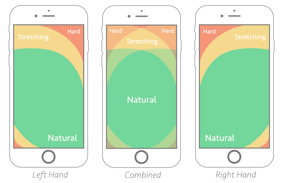
- Thumb-friendly interactions: Design touch targets at least 44x44 pixels, place key actions (e.g., CTAs) in the thumb zone (bottom half of screen), and use bottom navigation bars or hamburger menus for effortless one-handed use.
Best Practices for Thumb-Stopping Impact
- Simplify navigation: Limit menu items to 5-7, use sticky or collapsible elements, and avoid disruptive pop-ups that block scrolling.
- Optimize performance: Compress images, enable lazy loading, minify code, and use fluid layouts (percentages over fixed pixels) for sub-3-second load times, reducing bounce rates.
- Enhance readability and visuals: Choose large, scalable fonts (16px+), high-contrast colors, sparse high-quality images, and bold CTAs to grab attention without overwhelming small screens.
- Progressive enhancement: Build for mobile first, then scale up—adding features for tablets/desktops without compromising core mobile UX.
| Practice | Thumb-Stopping Benefit | Supporting Tactics |
|---|---|---|
| Prioritize Content | Delivers value in first tap | Short copy, SEO-optimized keywords, user scenarios |
| Speed Optimization | Holds fleeting attention | Image compression, CDN, efficient scripts |
| Accessible Design | Inclusive engagement | Alt text, screen reader support, color contrast |
Implementation Steps
- Build user personas and empathy maps to align content with on-the-go needs.
- Create mobile wireframes at smallest breakpoints, test usability on real devices.
- Ensure accessibility and SEO from the start for broader reach.
These practices, drawn from design experts, create clutter-free, engaging mobile experiences that boost conversions by focusing on what users truly need first.


Maple Ranking offers the highest quality website traffic services in Canada. We provide a variety of traffic services for our clients, including website traffic, desktop traffic, mobile traffic, Google traffic, search traffic, eCommerce traffic, YouTube traffic, and TikTok traffic. Our website boasts a 100% customer satisfaction rate, so you can confidently purchase large amounts of SEO traffic online. For just 720 PHP per month, you can immediately increase website traffic, improve SEO performance, and boost sales!
Having trouble choosing a traffic package? Contact us, and our staff will assist you.
Free consultation