
Mobile-first design prioritizes creating experiences optimized for mobile devices first, then progressively enhancing for larger screens, while page speed optimization ensures fast loading times through techniques like image compression and efficient code to retain users.
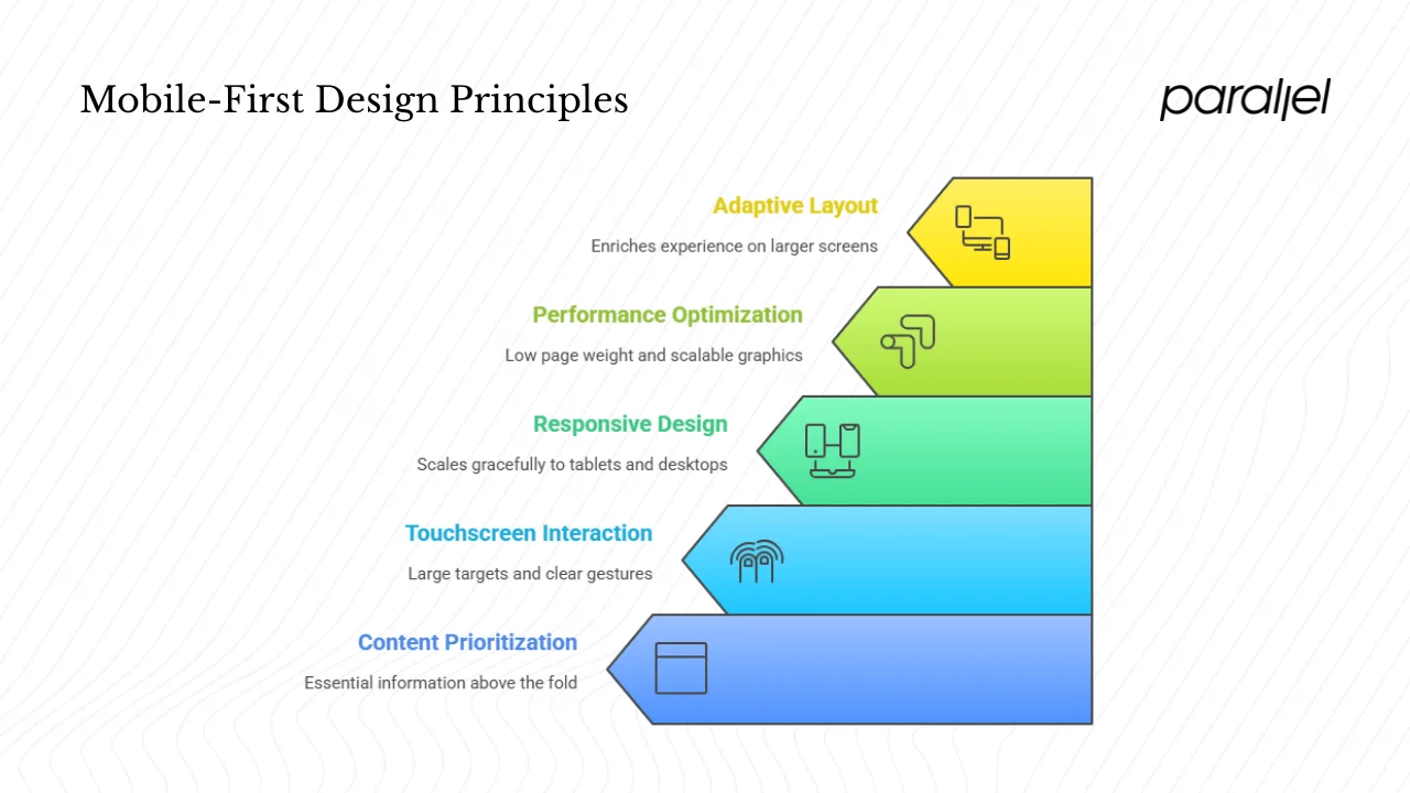
Core Principles of Mobile-First Design
Mobile-first starts with the smallest screens (smartphones) to focus on essential content, navigation, and functionality, scaling up with added features for tablets and desktops via progressive enhancement. Key steps include:
- Prioritize content: Identify and display only core elements like key pages (home, products) based on user goals, using a clear hierarchy to guide flow.
- Simplify navigation: Use intuitive, space-saving options like hamburger or bottom menus with familiar icons and labels; avoid clutter.
- Design for touch: Make buttons and targets at least 44 pixels square with ample spacing to prevent mis-taps.
- Build responsive layouts: Employ fluid grids, flexible images, and CSS media queries (e.g., via Bootstrap) for seamless adaptation across devices.
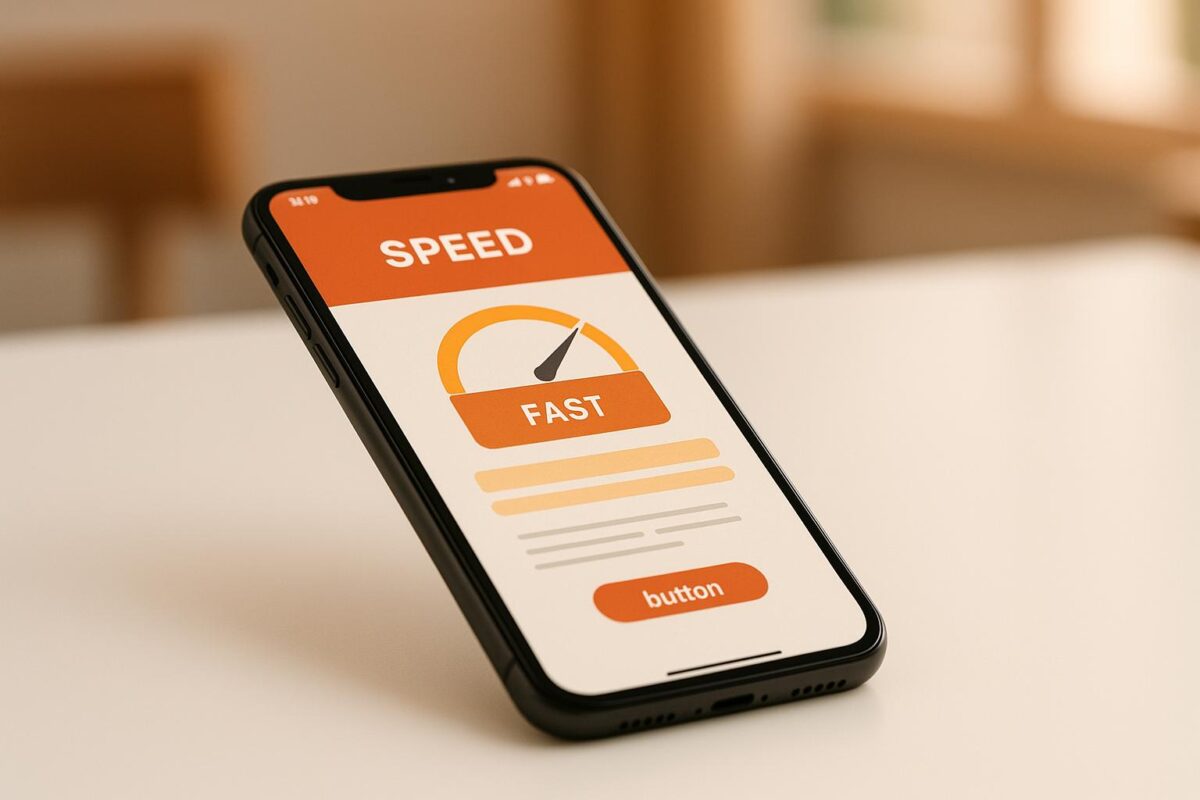
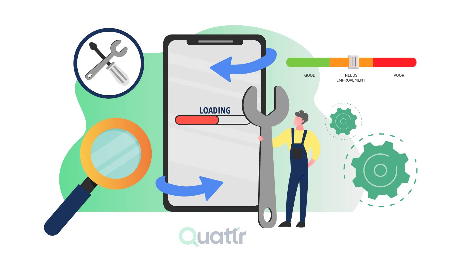
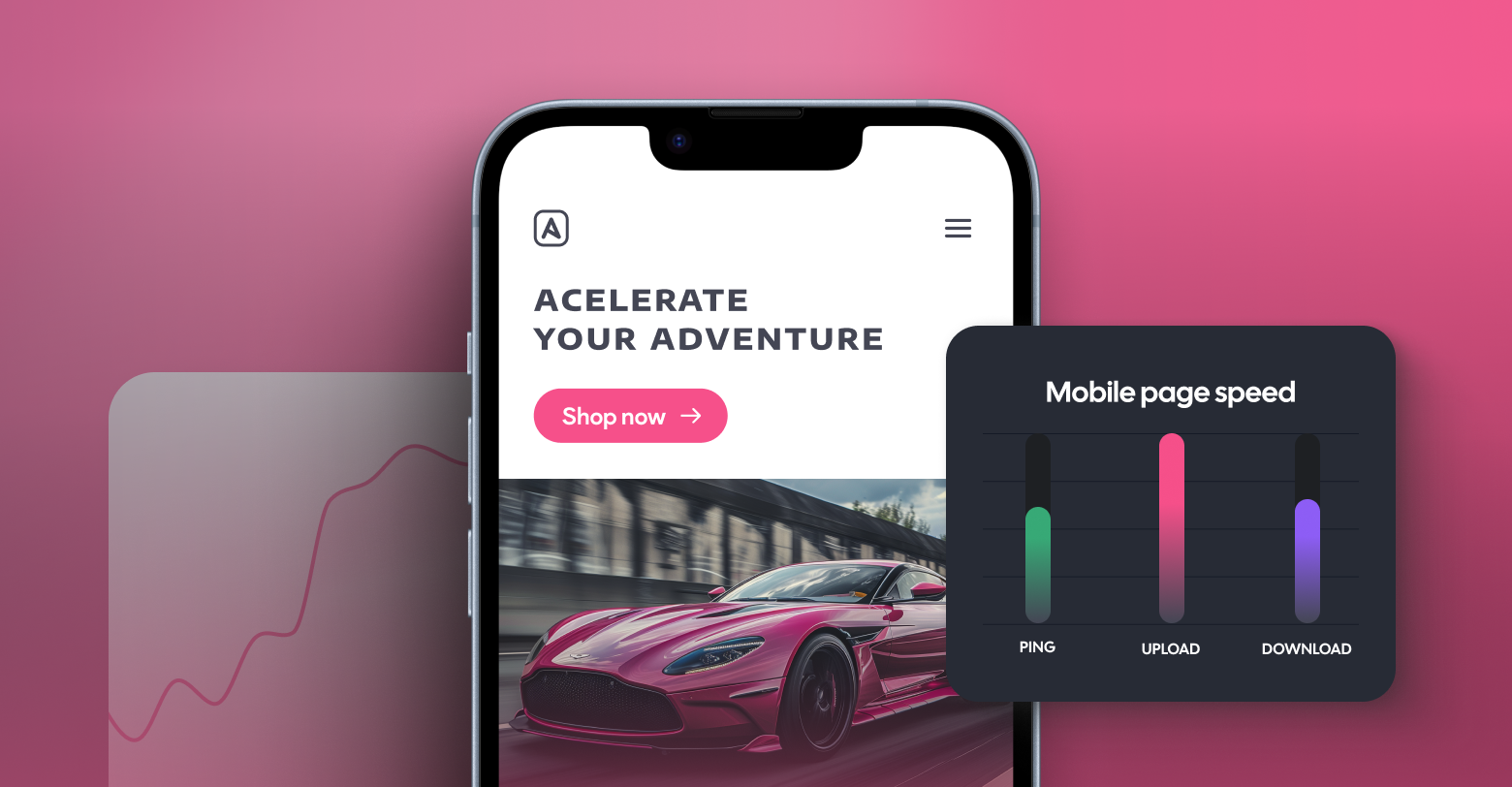
Page Speed Optimization in Mobile-First
Mobile users expect instant access, so optimization is critical to reduce bounce rates and boost engagement. Essential techniques:
- Compress images, videos, and graphics to minimize file sizes without losing quality.
- Use minimal scripts, efficient CSS, and avoid heavy elements like complex graphs on mobile.
- Implement responsive techniques for fluid adjustments, cutting unnecessary load on browsers and servers.
- Test on real devices for load times, readability, and navigation smoothness.
| Approach | Focus | Best Use Case |
|---|---|---|
| Mobile-First | Build for mobile screens first | New projects with mobile-heavy traffic |
| Mobile-Friendly | Adapt existing desktop sites | Quick retrofits |
| Responsive | Fit all sizes universally | Broad device compatibility |
Following these practices ensures better UX, easier scalability to larger screens, and performance that meets mobile constraints like limited bandwidth. For implementation, sketch mobile wireframes first, then expand iteratively.


Maple Ranking offers the highest quality website traffic services in Canada. We provide a variety of traffic services for our clients, including website traffic, desktop traffic, mobile traffic, Google traffic, search traffic, eCommerce traffic, YouTube traffic, and TikTok traffic. Our website boasts a 100% customer satisfaction rate, so you can confidently purchase large amounts of SEO traffic online. For just 720 PHP per month, you can immediately increase website traffic, improve SEO performance, and boost sales!
Having trouble choosing a traffic package? Contact us, and our staff will assist you.
Free consultation